Oh, Twitter, How I Hate to Love You.
I won’t pretend to be an experienced, long-time Twitter user. In fact, I used to believe that only tweens and people who randomly chattered on about the most inane happenings of their daily lives used Twitter. I never had any urge to even sign up, but I once felt the same way about Facebook and now I’m accessing it daily. However, my reasons for finally utilizing both sites are quite different, as are my current impressions of them. I joined Facebook because all my friends eventually migrated there from Myspace, swallowing my protests in the interest of maintaining relationships. I didn’t start using Twitter until I decided to use social media as a marketing tool, but I had no idea just how effective Twitter could be for such practices. Facebook still bothers me in many ways, especially from a business point of view (which I’ll explain in a later article), but after only a few weeks of using Twitter I began to admire the site.
At this point, I’ve been a Twitter user long enough to understand its features and I’ve become completely familiar with its design, but a short while ago (maybe a few weeks, at most) I noticed something interesting that sparked my curiosity. I was in the process of reading articles on social media marketing when I came across one that explored the many parody profiles that had grown substantial followings. When I decided to check out one of the clever profiles it had a lovely, professional appearance I’d never seen before. I’d made a mental note to conduct some Google research to see if the administrator had used some sort of third-party code or what-not, but my focus shifted to urgent matters and the topic slipped my mind. At least, until today…
Simple. Clean. Professional. What More Could Users Want?
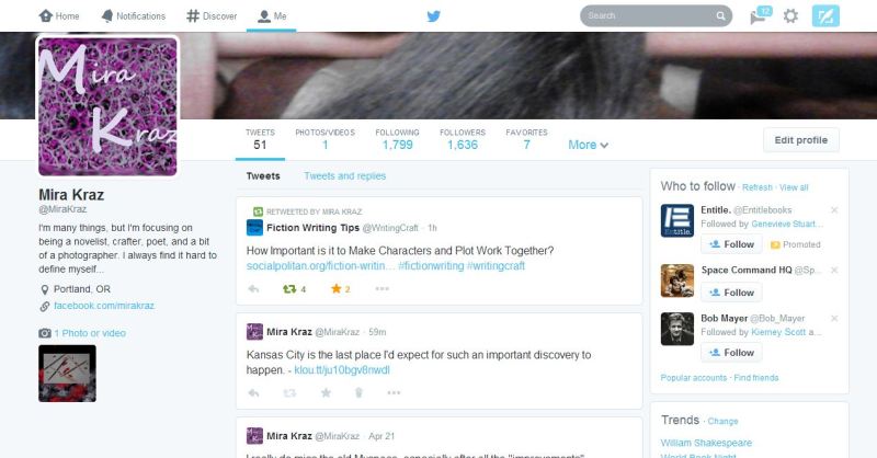
As you can see, some aspects of the new pages are the same (at least, for now), like the bar at the top and other such elements, but just about everything has been completely rearranged and a few nifty new tools are now available. I’ve tinkered with the new profile layout for a few hours and I’ve already figured out where everything is, so it’s easy to navigate as well. So, let’s take a look at the pros and cons of the new design.
PROS
In the interest of being thorough I feel that it’s best to take a systematic approach when tallying points for or against a topic, so I’ll be going through everything by page or section. Here’s what I’ve found:
Landing Page/Tweets
The new navigation bar located toward the top of the page takes a more direct approach than the old ones. The colored line at the bottom indicates which page you’re on and the upfront tallies beneath each title cut to the chase. The only aspect that confuses me is the “More” tab, which only has a link to the user’s Lists. I don’t know if Twitter plans on adding more features that will later be added to this tab, but if not they should consider making a change there. All in all, it’s an improvement in my eyes.
Just below the new navigation bar you see a fantastic little feature that allows you to control the types of Tweets you see. Now you can skip the public conversations a user has had with another, giving you a clear list of only Tweets and ReTweets, thus cutting down on confusion. (If Twitter had a feature like this before then please let me know in the comments so I can remove this entry. Like I said, I’m not an expert, but I don’t recall ever seeing anything like this before.)
I tried digging through my followers in an attempt to find someone with both of those indicators, but everyone on my list was still using the old design. Anyway, I’ve come across a few accounts that had tried to fake both of those icons by adding screen shots of them into their own images, aligning them so that they’re convincing if you don’t examine them deeply. Since the new design doesn’t allow changes to the background behind these symbols you won’t have to watch out for such fraudulent behavior anymore.
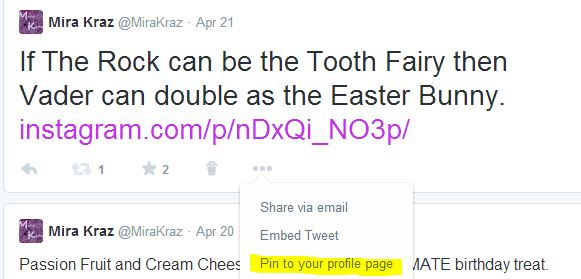
The ability to pin a post at the top of your profile allows you to make important information widely available to anyone who checks you out. It’s just as easy to unpin a Tweet, which involves similar steps used to pin it in the first place.
While there are other aspects to the new design that I really enjoy I’ve decided to omit them in the interest of keeping this article from running on too long, thus making it intolerable. Let’s move on.
Photos/Videos Page
The page detailing all the pictures and videos uploaded by its user now contains more information, allowing you to easily view the story behind the submissions. This does cause the same picture or video to appear more than once if the user added it to multiple posts, but unless the account tends to post spam-like Tweets that shouldn’t cause issues.
Following & Followers Pages
What initially appeared to be an inefficient organizational system quickly turned out to be extremely convenient and a major time-saver. If you’ve ever had to dig through a follower/following list with over a thousand entries then you will probably love this improvement just as much as I do. With the old layout I had to click on each user’s name to see my connection to them, but this design shows me that information immediately. There is a bit of a downfall, which I’ll mention later, but I do feel that the benefits outweigh it pretty well.
Favorites
The Favorites section is pretty similar to the previous design and I haven’t found anything extremely noteworthy yet. If I do I’ll be sure to add it here.
Lists

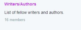
As you can see, not a lot of information is displayed when you check the List page, but that’s understandable.
The list of Lists is one of the few points in the new profile where they skimp on information, but that isn’t always a bad thing. The only thing I wish they’d add is the number of subscribers, but I can live without that.
Cons
I will probably always find something I dislike about every page on the internet, but most of the time it isn’t worth the breath needed to speak about them. Unfortunately, there are certain aspects about the new profiles that go beyond annoyance, so I’ve listed them below.
Landing Page/Tweets
As you can see, the usual options involving replies, ReTweeting, favoriting, deleting, emailing, embedding, and reporting a Tweet are on hand just like before (the last three are still located under the three dots), but the omission of the “expand” option was a bad move on the designer’s part. I used to love how easy it was to see all the details of a particular post without navigating away from the page, but that ability is sadly no more. What makes matters worse (for me, at least) is right-clicking on a Tweet won’t give me the option to open its link in another tab, causing me to rely heavily on my browser’s “back” button, which I’ve always despised. I sincerely hope that this oversight is changed soon.
Another point that I was a little bummed about was the lack of the ability to add a background image like before. The header images make up for that change, and I understand why they did away with that option, but I’ll still miss it. It isn’t really a severe con, though.
Followers/Following
The old format gave you the ability to open mini-profiles when you clicked on a user’s name, but apparently the designer’s felt it redundant since they added so much extra information to the follower/follow lists. Clicking those links take you directly to their profile, so now getting a sample of someone’s latest Tweets isn’t so simple. At least with this con I can still choose to open the profiles in a new tab or window, but it will still consume more time.
Also, another pitfall I’ve found is that the tile format causes a lot of drag and lag, making digging to the bottom of the list a huge headache. Of course, the same could be said of the old lists, but the failing wasn’t as noticeable then. I compared new and old just to be sure, and there’s a pretty big increase in the time it takes me to scroll to the bottom of those lists.
To any Twitter employees that might happen to read this (I know it’s a slim chance, but it’s worth a shot):
Tell your bosses (or if you are the boss tell your developers) to stop using those infinite scrolling pages. Having to click “Next” a bunch and navigate several pages is way easier to deal with than your fancier means, trust me.
In Conclusion
That should be all the important points I’ve noticed thus far, but if I happen to think of others I’ll be sure to update this post. For me, the pros far outweigh the cons, and I really enjoy using the new design, but that isn’t why I wanted to write this article. So here’s the big question:
What do you think of the new Twitter profiles?
Leave a comment with your own review, let me know if I missed something, say how much you hate the changes (or this article), I don’t care as long as you say something!


